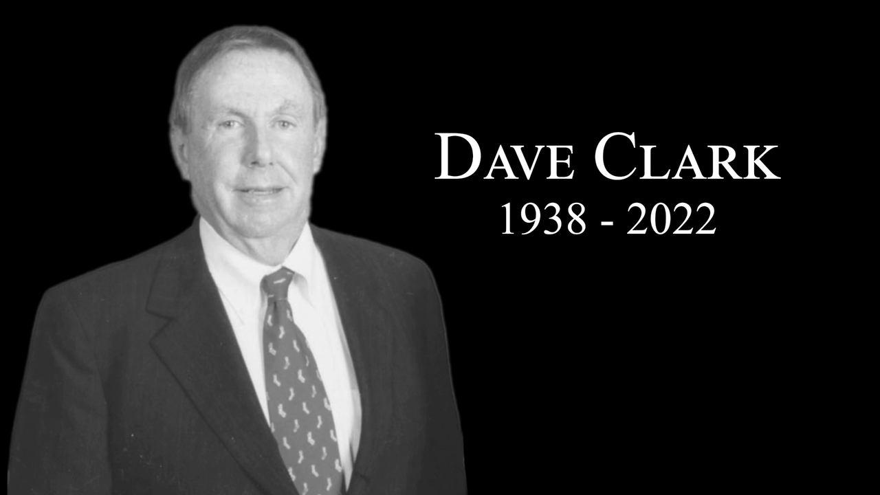
Clark & Sullivan makes tough decision: Rebrand
By-Anne Knowles
This is the first in an NNBW series on Clark & Sullivan Construction’s project to rebrand
No business wants to rebrand. It is risky, costly and the transition from old to new can be chaotic. But, as Clark & Sullivan Construction found out, sometimes change is necessary.
“We lost the E. L. Wiegand Fitness Center. We didn’t even get shortlisted and for someone that’s done 12 buildings there,” says Sheila Hlubucek, director of business development at the Reno-based construction firm. “That was a wake-up call.”
National firms vied to build the four-story, 100,000-square-foot building at the University of Nevada, Reno, but in the end the $46 million project was awarded to another local contractor, Sparks-based Q&D Construction Inc.
The problem, says Hlubucek, is an outdated image of Clark & Sullivan as a hard-bid contractor in an industry increasingly utilizing a different bidding method called Construction Management at Risk.
Under CMAR, contractors and architects collaborate during design and work under a cost cap to keep projects on time and within budget. Public works projects such as UNR’s fitness center now use the protocol exclusively.
Clark & Sullivan uses CMAR, too. Half the company’s business is out of its Sacramento office, where all bids are CMAR. About two-thirds of its Reno-based jobs are CMAR, too, says Hlubucek.
But its history as a hard-bid contractor was hurting the 33-year-old construction firm, so the time seemed right for a total rebranding.
“I came on board in April and in the first week I caught BJ (Sullivan) and said this logo is not working,” says Hlubucek. “Senior leadership didn’t think they needed new branding. So I did a presentation, showed them a comparison between our logo and EDAWN (Economic Development Authority of Western Nevada) partners and showed them how bad it looked compared to them.”
There was some resistance.
“Most reluctance came from the CFO who has to pay for it,” says Hlubucek.
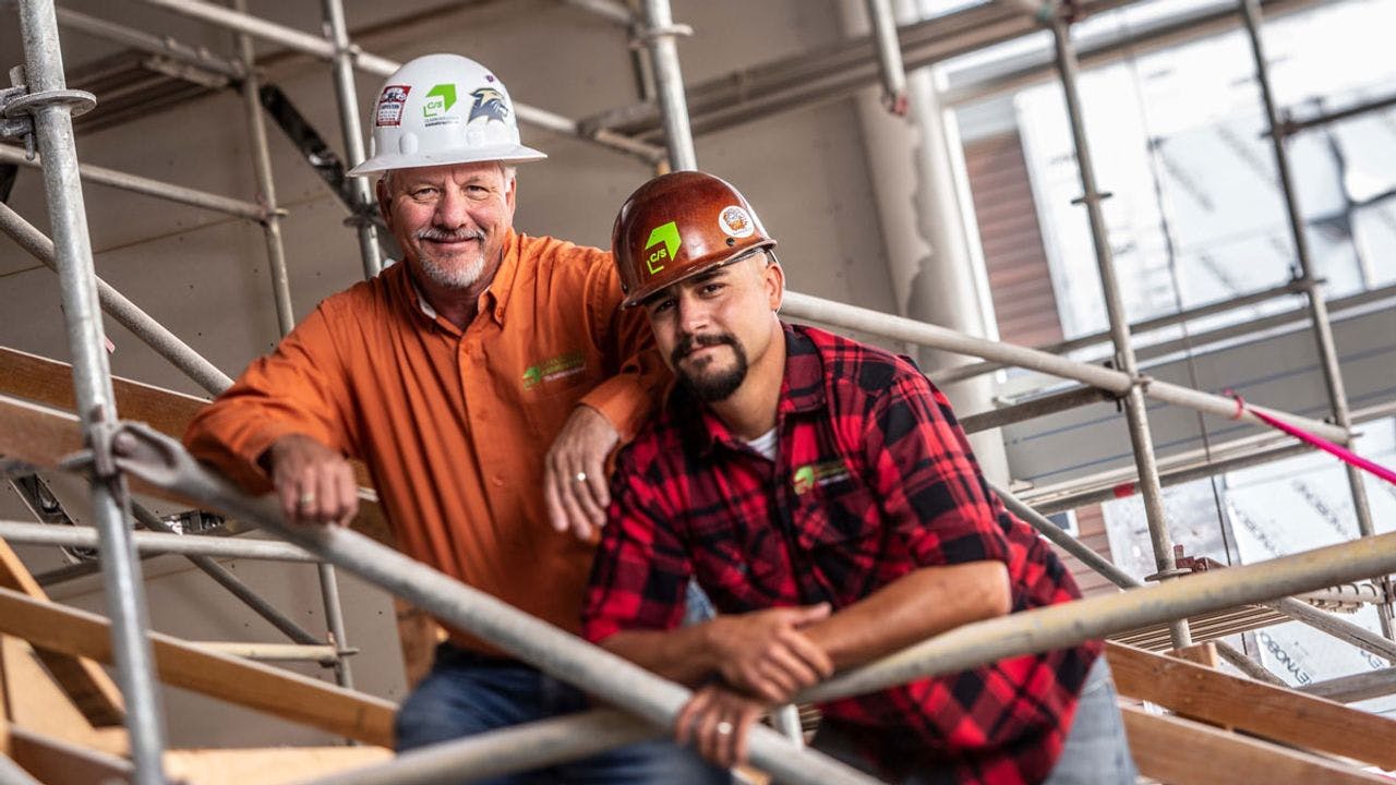
Logos are used extensively by construction firms, from coffee cups to hard hats to the 8-foot-high job signs that anchor construction sites.
Clark & Sullivan, for example, will eventually replace decals on 60 vehicles, roughly 20 jobs signs and about 150 safety vests and hard hats, in addition to letterhead, business cards and anything else that bears the current design.
But Hlubucek convinced the seven-member leadership team and in May sent out a request for proposal. Four graphic design firms replied.
“All were excellent proposals,” says Hlubucek.
The four were narrowed down to two, who made presentations. Included was Stan Byers, owner of Stan Can Design in Reno.
“Stan took them through case studies, and how it worked,” she says. “The work he did for Employers Inc. had a big impact on some of the people in the room.”
Byers had helped Employers re-craft its image to go from being a local provider of workers compensation insurance to a national supplier.
“Leadership wanted to go nationwide and everyone else in the company was focused locally,” says Byers. “We came back with a tagline — America’s small business insurance specialist — and that drove everything.”
The representation won Stan Can Design the project and Hlubucek, who sees her job as shepherding the rebranding effort, was pleased because she wanted a boutique firm that could continue to work on more projects and help the company with its first construction bid — some of which run up to 200 pages — after launching the new brand.
Stan Can Design deliverables will include a new Clark & Sullivan logo that will scale from business cards to jobs signs and a toolkit of fonts, colors and other design elements for InDesign, a desktop publishing application, for use in bids, proposals and other correspondence.
The first step was a meeting last month between the Clark & Sullivan leadership team and Johanna McLain, a brand identity consultant, to determine the company’s brand pillars, which help guide brand design.
“It’s a good reason to think of mission and values, everything that underpins the design,” says Byers. “The brand has to control the message or other people will control it for you.”
Next, Stan Can Design will deliver a 50-word script based on that material that can be used to keep everyone inside the company on the same message.
Then the designer will create a handful of what Byers calls “mood” boards showing possible color scheme and look for the company to choose from before Stan Can delivers the final design.
The goal: to be ready for UNR’s next RFP for architectural design phase of a new engineering and science building and renovations on its existing Palmer Engineering and Scrugham Engineering/Mines buildings.
Part 1 – http://www.nnbw.com/news/13061258-113/design-sullivan-clark-construction